This is to reflect on and take in the results of submitting the corrections as for January 25.
It is listed as for January, but I confess that I was unable to submit it in time for two days and was only able to submit it on February 2, the knotty day of the month. I apologize for the delay despite my promise.
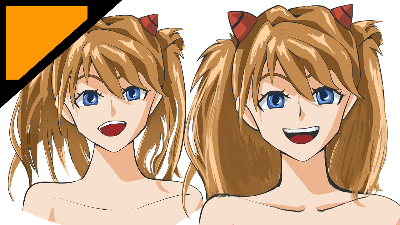
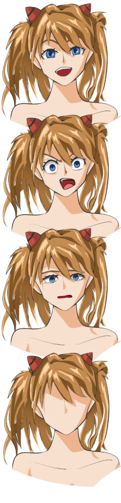
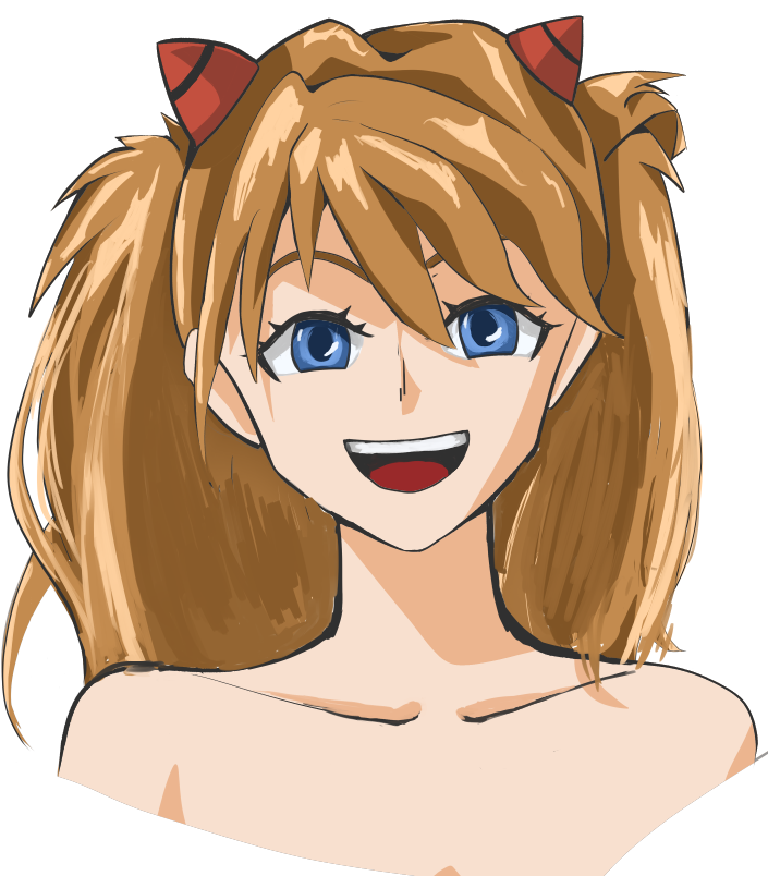
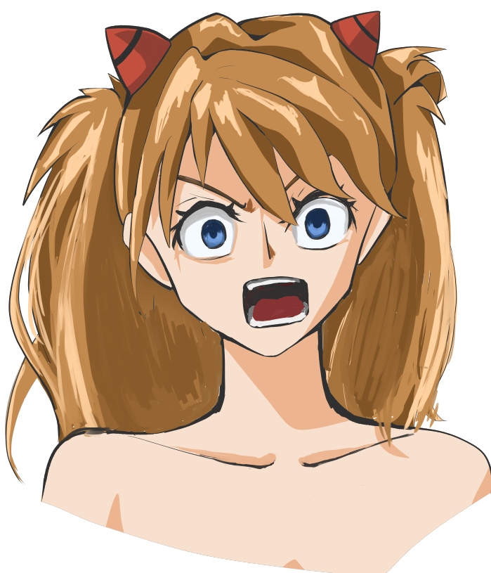
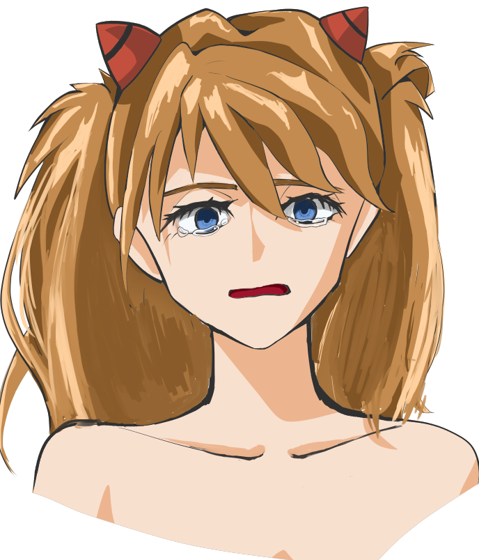
This is a facial expression difference that for some reason has been made vertical.
I have never painted a face alone, and even though I like pictures with clear facial expressions, I have never painted separate facial expressions, so this time I painted the facial parts without putting much effort into the other parts of the face.
For the first time this time, the point is exactly as it should be.
Differentiation of facial expressions
To be honest, I thought that I could have drawn her as Aska pretty well.
I thought.
Points raised in the correction
I receive the results of the corrections in the form of images, but I am asked not to reproduce them because it would be embarrassing. The following is a list of the points made, with the pointed parts transcribed into text. The figures in parentheses are my personal opinions.
This is going to be a template.
The overall outline is frontal, but the parts are nana. Look at the whole picture!
Align the contours as well as the parts.
How much of the back teeth can you see when looking at the front? Is the position and angle of the teeth correct?
Let’s look at the shape of the neck!
How is the position of the collarbone?✘
Even if you want to draw it in a broken way, let’s learn the basics first!
Why is the hair not finished? Is it finished? Did you just not get it done in time? Did you just run out of energy?
(If you’re going to draw facial expression differences), draw one of them completely. If you get one right, it will be easier to make a difference.
Summary
1 piece! One character, even if it takes a long time! Let’s draw it right up to the end! Don’t compromise! Next time, let’s draw the whole body again!👊
Responses and actions to the points raised
Although you did not mention the facial expressions, which had been a concern of mine, you made a good point again. I have to admit that some of the points made this time were familiar to me, and others were well-true. I will check them again one by one.
The overall outline is frontal, but the parts are nana. Look at the whole picture!
This one is very familiar to me.
I had intended to draw it as a front view from the beginning, but during the process of drawing the eyes, I noticed that the outline was tilted at an angle, so I proceeded to draw the eyes and mouth as if they were also placed at an angle.
However, I thought it would look prettier with the outline facing the front, so I changed it to make it look more like the front.
I thought I had fixed the eyes and mouth at that time, but I guess I didn’t fix them properly.
I guess that’s what happens when you can’t notice it, but I’m not observant enough.
I’ll try to fix my smile of joy.
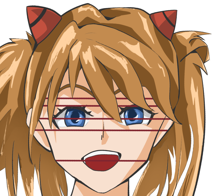
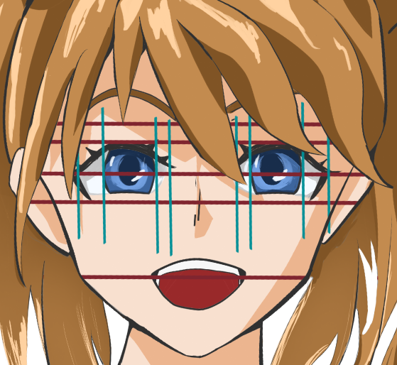
Check by drawing an auxiliary line. There is a tremendous amount of misalignment.
This method of checking with auxiliary lines was recommended by illustrator Shigure Ui in his video, and it is indeed very clear at a glance.
Vertical auxiliary lines are also included for confirmation. However, if I rely on this too much, the face may give a mechanical impression, but since my sense is not sufficient to begin with, I think I will continue to rely on it until I can firmly put it into my mind.
Eventually, I would like to rely on fluctuation as a proper taste, or my own drawing style (which I still don’t understand).
Align the contours as well as the parts.
I understood that this is an area where the position of the chin, cheeks and temples are slightly misaligned with respect to the center line of the face.
I think this is because it is a frontal face in particular, so the slightest deviation is noticeable.
In this case, the face itself is tilted just a little bit, so it is even more difficult for my eyes to grasp, and I find it very difficult to align it correctly.
On the other hand, it is a bit frustrating to draw a frontal face using a contrasting ruler, but I am in a dilemma because I am not skilled enough.
I don’t think that the symmetry of the face is what is being pointed out, but rather the obvious distortion of the face.
How much of the back teeth can you see when looking at the front? Is the position and angle of the teeth correct?
This point stings in a completely compromised area. I know it would be a very oppressive review if it were actually phrased this way in a work review or something, but it was hard to get a good gist of it, even in writing.
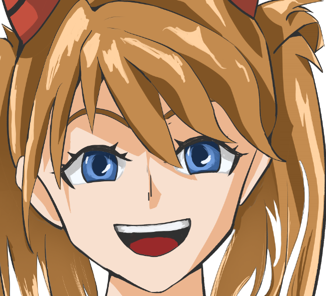
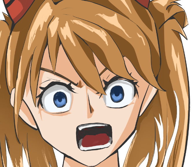
Pointed out, especially the laughing face and the angry face. (I know it’s two of the two with teeth drawn on them)
In this illustration, eye-level-wise, I intend it to be about where Asuka’s eyes are, so at least the upper back teeth can be seen, which is obviously not right, as you pointed out.
Even with a frontal face, the back teeth should be visible if the illustration has a larger open mouth, or if the chin is raised a little more, or if the eye level is lowered and the illustration is in an aori composition.
I wanted to draw the teeth, but without knowing the details, I pushed through the part just by the atmosphere without examining it in detail.
There is a fear of being stabbed precisely where you cut corners, but I guess that means you shouldn’t cut corners on facial parts after all.
The smiling one.
Angry face.
The details are not quite there yet, but it seems to have started to look a little more natural. ……?
It is difficult to draw a mouth every time.
I have a mouth like I want to draw, but I am having a little trouble verbalizing how I should draw it. I think I have to practice copying illustrations of my favorite patterns, but I am not making much progress.
I really want infinite time.
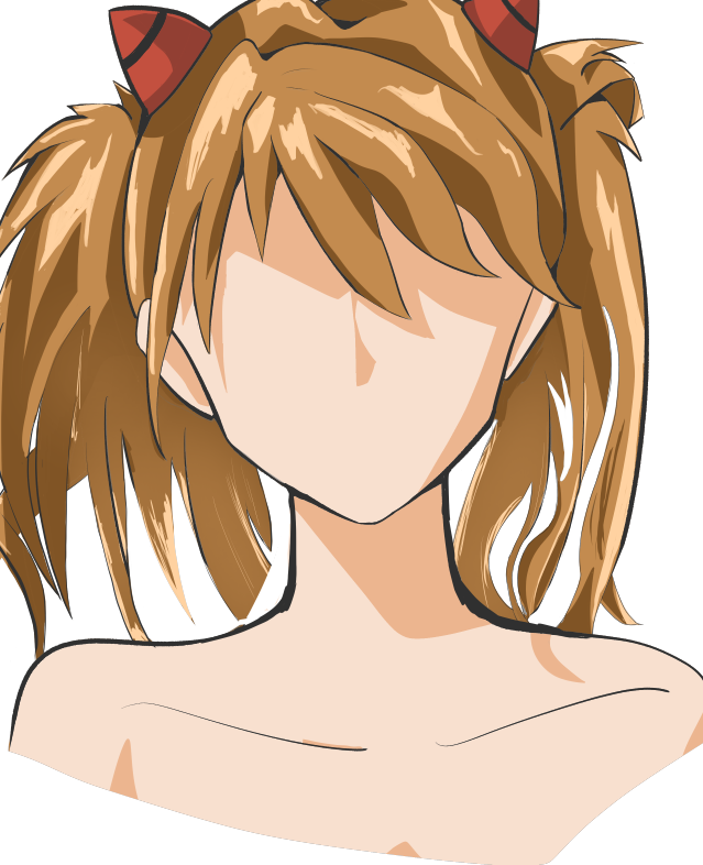
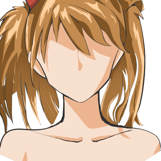
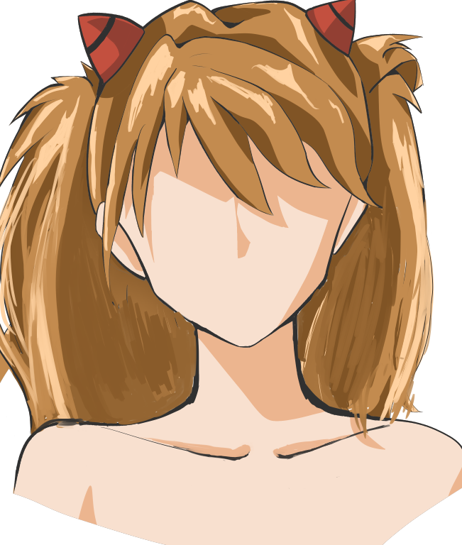
Let’s look at the shape of the neck!
Neck. This is another point that rings a bell.
I had a feeling of discomfort at about the time of the color rough before completion.
At that time, I submitted the following to Bluesky.
It’s a distorted version of the contour, but there is something wrong with the neck.
I was so concerned with the content of the face that I failed to pay attention to the overall silhouette at this point, which left me with a lasting impression.
I think the neck should be drawn as a cylinder, but it looks like it is subtly merging with the trapezius muscles.
Asuka is slender, and it would be more appropriate to draw her slender neck straight, so I’ll try to make it look like that.
It’s a little hard to organize the layers and the lines look a little dirty, but I think I did a lot better than the neck above.
How is the position of the collarbone!!✘
This one doesn’t quite fit, but it is somewhat low?
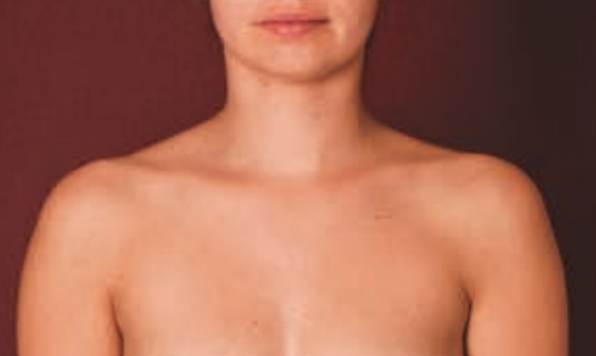
In these situations, I’ll flip through the Art Anatomy for Sculptors that I’ve gone to the trouble of purchasing.
Cited in Art Anatomy for Sculptors (p. 71)
Even though the illustration is deformed, I still think the overall position is a little low.
Also, the collarbone on the left side of the chest is a little long.
I wonder if it looks something like this: ……
Even my own pictures didn’t feel uncomfortable, but I still can’t feel this collarbone discomfort when I look at other people’s pictures.
I bought a sculptor, and I need to use it properly.
I look at it from time to time, but I should probably start copying it. I need time.
Why is the hair not finished? Is it finished? Did you just not get it done in time? Did you just run out of energy?
The pressure is great.
At first, there was more hair as shown in the rough sketch I put on the neck shape, but it felt heavy and I tried to lighten it somehow, and that was the result of trial and error.
In short, the sad fact is that the work was completed in my opinion, but it appeared halfway through to those who can draw.
I know it has been said several times before, but this time my attention was focused only on the facial expressions, and I neglected (or compromised) some aspects of the work, which I regret with a sense of sadness at my lack of ability.
I have a pattern that I want to express in my hair, but I don’t know how to express it, and I’m not fully satisfied every time.
I had a dim sense of this, but now that it has really hit me, I have to make it a priority.
Asuka itself seems to have a lot of hair, especially in the back, so I feel that even if the hair is heavier, it would be more Asuka-like if it did not have strange gaps.
(If you’re going to draw facial expression differences), draw one of them completely. If you get one right, it will be easier to make a difference.
This is a general point, but they drew the eyebrows, eyes, nose, and mouth after applying the points so far to the base I had drawn on the sample, and pasted in an Asuka that was many times prettier.
The angry Aska is many times angrier than my Aska, and the sad Aska looks extremely sad.
I copied it, lowered the opacity, and let it show through on top of my drawing. I realized that dozens of small differences, such as the misalignment of outlines, the flow of hair, and (though I did not point it out) the position and shape of the left ear, all add up to a difference in quality. (It is a bit presumptuous of me to make such a comparison.)
General review section
『1 piece! One character, even if it takes a long time! Let’s draw it right up to the end! Don’t compromise! Next time, let’s draw the whole body again!👊』
What a surprise, five surprise marks.
I get the vibe that it’s transparent that there are a lot of parts of the project that were properly mishandled due to lack of time (and presentation delays), but that’s not the case.
I simply don’t have enough performance in me.
I originally wanted to practice facial expressions, and I had planned to draw a bust shot, so it is not a full-body picture, as planned. The same goes for the lack of a background.
However, in terms of no compromise, you are right about the shape of the neck and hair, which you pointed out to me.
The hair was not a compromise, but rather the result of thinking that this was the way to go, but it turned out to be an empty result.
Summary
The general review section is also like a summary, but I feel a strong sense of regret that I was not able to request corrections during the month of January because I was too busy starting up my blog and doing my normal work after the vacations, even though I had time to do so.
February is a bit busier than January despite having fewer business days, which is a bit of a problem, but I would like to complete the illustration with the required one character all the way through to the end.
Fortunately, there are two national holidays, so we will make the most of them.
However, as I posted on Bluesky, I have an idea of the composition, but I am a little hesitant because I am not confident that I can draw it now.
I think the composition itself is a composition you see often, but it is usually very difficult.
I am also planning to draw bare feet for the first time as a point of reference.
Lastly, I would like to mention Aska and the others that I reworked this time.


Comment