
This is a reflection and incorporation of the feedback I received for the submission in April 2025.
The previous submission was (sort of) in January, so this is about three months later.
I’ve been busy with work and feeling down, so I haven’t been able to send it, but I decided to request feedback.
The result was pretty rough, though.
- Feedback Subject
- Points pointed out in the feedback
- Responses and actions to the feedback
- Head is long
- Where are the eyes looking?
- Ear position
- Since it’s a worm’s-eye view, shouldn’t the chin be visible?
- Mouth tends to be distorted
- The body looks directly frontal
- (Pointing at the right hand) It looks like it could reach, but is the length enough?
- The length of the arms is different between the left and right
- The perspective of the chair is distortedThe distance between the back of the chair and the rear legs
- Left foot: arch of the foot
- Left foot: look closely at the bones and muscles of the foot!
- Left foot: connection is not visible (referring to the leg and foot)
- Right foot: try to capture the shape more
- Overall review section
- Summary
Feedback Subject
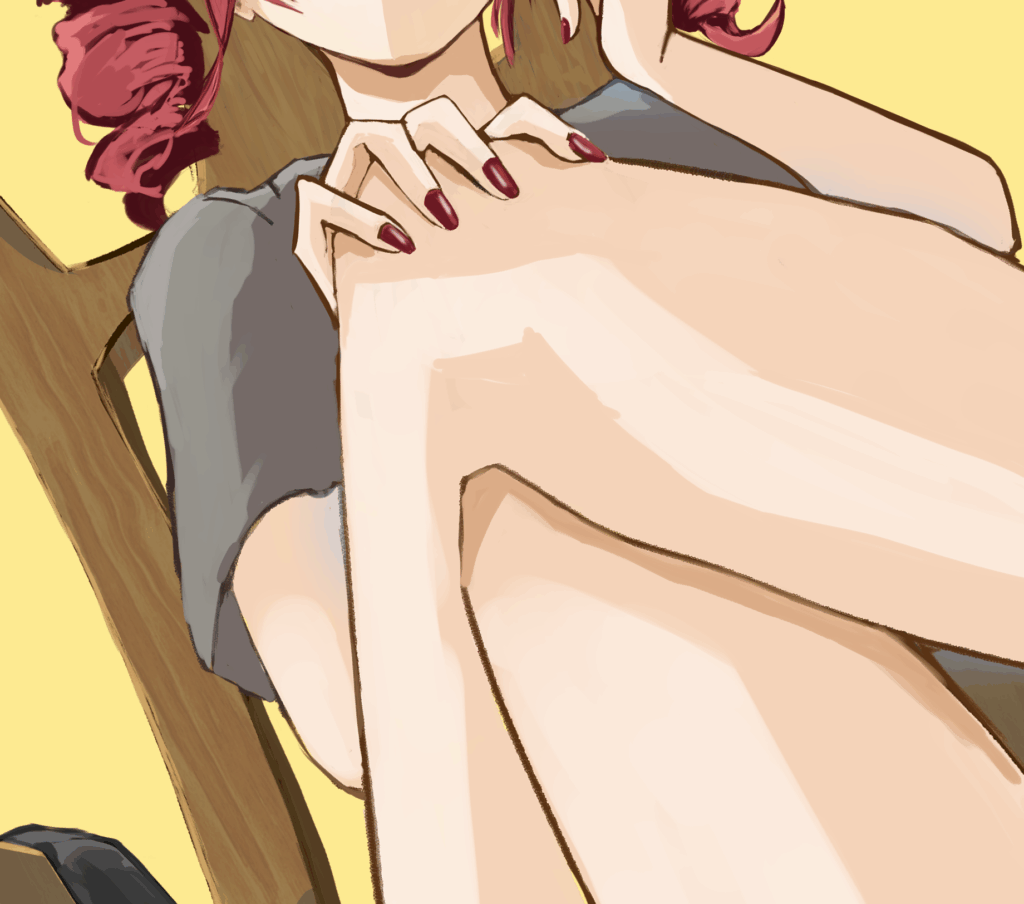
The subject of this feedback is Kasane Teto’s Override. I listened to this song a lot. I love it.
This time, I wanted to try drawing bare feet and make the face cute.
I thought I drew it pretty well. Even now, the day after, I still kinda think so.
I said something similar last time, but thinking is free, right?
Points pointed out in the feedback
The feedback result is given as an image, but I was told not to repost it because it’s embarrassing, so I’ll write down the pointed-out parts as text and list them. The parts in parentheses are my personal opinions.
This is a template.
- Head is long
- Where are the eyes looking?
- Since it’s a worm’s-eye view, shouldn’t the chin be visible?
- Ear position
- Mouth tends to be distorted
- The body looks directly frontal
- (Pointing at the right hand) It looks like it could reach, but is the length enough?
- The length of the arms is different between the left and right
- The perspective of the chair is distorted
- The distance between the back of the chair and the rear legs
(Additional note) It looks like a chair of this size - Left foot: arch of the foot
- Left foot: connection is not visible (referring to the leg and foot)
- Left foot: look closely at the bones and muscles of the foot!
- Right foot: try to capture the shape more
Overall review
The human body doesn’t have an overall worm’s-eye view
The length and size ratios are generally inconsistent
Responses and actions to the feedback
As always, it’s kinda sad that they don’t praise me at all, but these two points in the overall review hit me hard. It’s like a total rejection.
Moreover, even as I’m writing this down, it’s tough that I don’t really understand what specific parts they’re referring to.
I can’t fix it without knowing the correct answer…
Anyway, I’ll proceed as much as I can. This time, I’ll be writing the article while making corrections in almost real-time.
Real voice.
Head is long
I get it. And I know how to fix it. I think this is point #1 where the worm’s-eye view isn’t working.
I’ve come to understand that when drawing a person from a worm’s-eye view, the head part should appear shorter than usual because there’s less to see.

Before correction

After correction
I made the head just a little bit smaller.
Like many others, I also watch feedback videos, and I’ve noticed that even though each individual correction or suggestion is small, those small changes often add up to completely change the overall impression. So, I want to gradually improve my output accuracy, even if it’s just a little bit at a time.
Where are the eyes looking?
I intend for them to be looking at the viewer, but is it the left eye?
I think I learned in a video somewhere that the reason why the gaze feels off might be easier to see by checking the ratio of white in the eyes.
When I have trouble aligning the gaze, I often use the method introduced in a video by Kakage-san (@kakage0904), where you cut out the black part of the eye and move it around to find the right position.
Before

After
But then I thought, “Wait a minute.” I feel like the gaze is definitely aligned in this cutout face, but the illustration itself is drawn with a worm’s-eye view from the feet. Wouldn’t it be wrong if the gaze is aligned in this cutout?
Could it be that the viewer’s eye level in an illustration is actually at the illustration’s eye level position, and it’s wrong if you don’t align the gaze with that?
This has gotten kinda interesting.
Before

After
It feels like they’re looking at me now.
When I line up the edited eyes, the third one definitely feels like they’re looking at me.
his way of thinking really clicked with me. It feels like it’ll be super useful from now on.
This might be the biggest discovery I made from the feedback this time.
Ear position
I intended to lower the ears, but it wasn’t enough.
Worm’s-eye view not working point #2.
Before

After
I lowered the ears, adjusted the jawline, and slightly corrected the hair silhouette. It feels like it’s being reshaped.
Since it’s a worm’s-eye view, shouldn’t the chin be visible?
I intentionally corrected the part where the chin was initially visible. I didn’t think it needed to be that prominent.
But now that you mention it, I feel like having this chin at this angle weakens the worm’s-eye view effect.
Worm’s-eye view not working point #3.
I’ll add the chin.
Before

After
Not enough? Enough? I’m not very confident here.
Mouth tends to be distorted
This feels like a habit of mine. It’s not like the mouth has to be perfectly open, and I actually love distorted smiles, but this drawing isn’t one of those, so I’ll correct the distortion as suggested.
The thing is, I already fixed the position and size of the mouth, but I guess I didn’t fully fix the shape. That’s probably it.
Before

After
I reshaped the size, position, and shape of the mouth. I also reshaped the bridge of the nose and corrected the teeth alignment. It really feels like a plastic surgery…
I feel like the chin got a bit longer, but I’ll leave it as is for now.
The fact that I noticed the distorted parts and roughly drawn parts when I was touching it up means that I was being sloppy when I was actually drawing it. It’s also a part that I haven’t been able to fix despite being told to draw each line carefully every time.
It’s not that I intend to draw roughly, but I think my awareness of the lines is low.
I didn’t even draw line art this time (there’s no line art layer), so maybe I should try focusing on line art again.
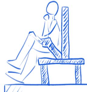
The body looks directly frontal
I’m guessing this feedback means that even though the pose is supposed to be diagonal, the body looks directly frontal. It’s just a guess since I can’t talk to them directly. This subtle relationship is frustrating.
I’ll try to adjust the depth along with the next feedback. Basically, it’s about the shoulder position
This is difficult. I’ll post the before and after corrections later.
(Pointing at the right hand) It looks like it could reach, but is the length enough?
They’re saying that the hand might not be long enough to grab the knee like that, but the hand does reach. I tried it myself.
But to make it look more natural, I’ll fix the depth of the shoulder, along with the previous and next feedback.
I’ll bring the right hand side closer and push the left side further back.
I know I should be aware of the body’s connection and flow when drawing the parts, but I’m not doing it. I’ll fix this all together.
The length of the arms is different between the left and right
I understood this to mean that the right arm is long and the left arm is short.
I feel like it’ll look natural if I fix the shoulder expression. Or maybe not.
I’m starting to think that these inconsistencies might have led to the overall review.
It feels like the face and left hand are small when I match the size to the right hand, and the others are too big when I match the size to the left hand and face.
It doesn’t look weird when I look at just the right shoulder and face, or just the face and left hand, but the ratio balance feels off when I widen my view to include the upper body.
I wonder how to notice these things right away…
I guess I just have to fill my toolbox with experience.
Here’s the result of fixing the three points together.
Before

After
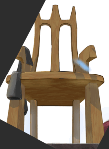
The perspective of the chair is distortedThe distance between the back of the chair and the rear legs
It’s the usual “Oh, now that you mention it” thing.
I drew the chair based on a reference photo, so I blindly assumed it was correct.
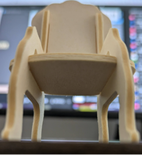
It’s a miniature chair photographed with an angle. I drew the chair based on this, but it’s a bit hard to compare because I rotated it during trimming. I think the curvature around the base of the backrest is making it look strange.
I received the following additional note in the margin. (Self-transcribed and posted)
“(Additional note) It looks like a chair of this size”
I guess they’re saying that it looks distorted because of how the backrest frame and the chair legs appear. But then I wonder how to fix it.
I’m not sure if this will be clear in text, but the backrest seems to be appearing closer than I intended. I wondered if “distorted perspective” meant they were pointing out a perspective issue, so I applied guidelines and a perspective ruler.
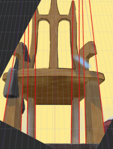
The red lines are the extensions of the existing legs, and the thin lines are the lines heading towards the vanishing point set by the perspective ruler.
The vanishing point of the chair is set outside the upper part of the screen, and I’m trying to emphasize the perspective with the angle of the front legs of the chair.
Given that, the direction of the rear legs being drawn almost vertically is incorrect.
If anything, the direction of the front legs is also a bit off when you look at both the left and right sides.
Yeah, the perspective is definitely distorted… And here I was, thinking I put so much effort into drawing the chair.
It’s tough.
I’m really worried about whether it’ll blend in with the Teto I’ve already drawn, but for now, I’ll try redrawing the chair according to the perspective lines.
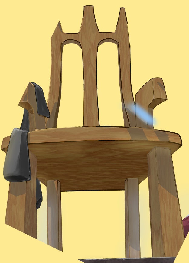
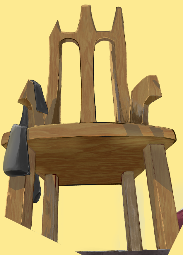
It’s a bit hard to see because I couldn’t overlay the text well, but the first image is before the correction, and the second image is after the correction.
The parts that overlap with Teto have thicker lines and I skipped the wood grain, but I think the perspective distortion is better now.
However, I don’t feel like I’ve fixed the backrest much.
As a last resort, I’ll darken the backrest a bit to give it a sense of depth.
I’ll ask about this later if I can.
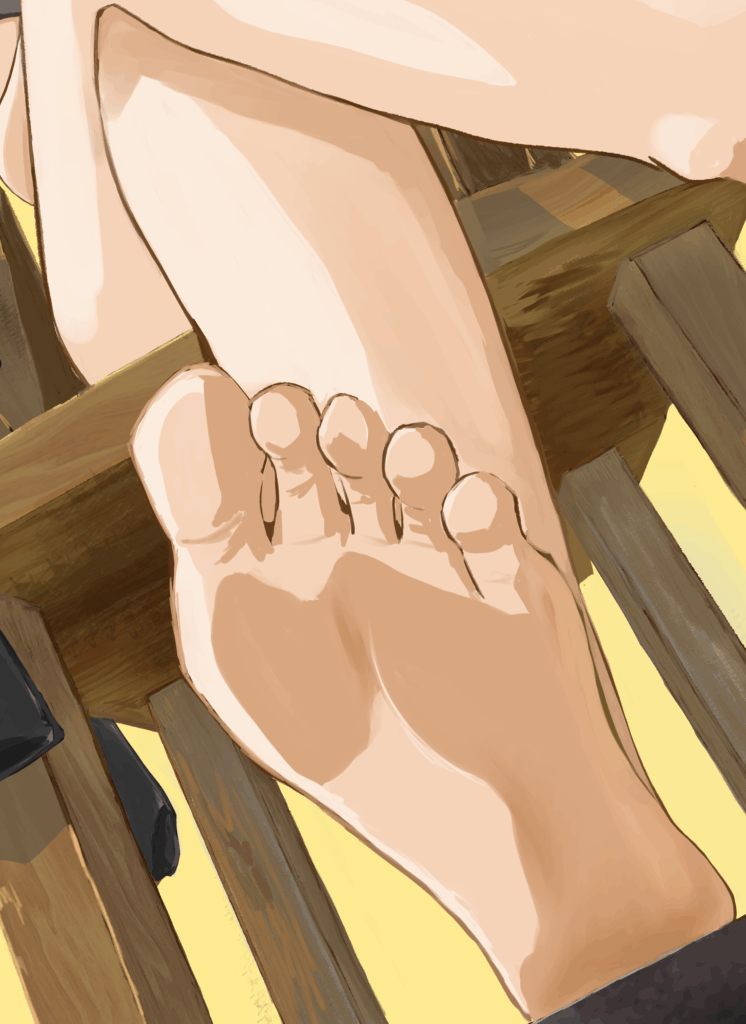
Left foot: arch of the foot
I guess they gave me this comment considering that I said I didn’t know how to paint feet.
They scribbled around the arch of the foot with a red pen and added guidelines for the “toe pads?”
I’ll fix the left foot based on this.
While fixing it, I realized that the shading itself is wrong. Since the light is coming from the left, the sole of the foot shouldn’t be lit up this much, so the whole thing should be darker.
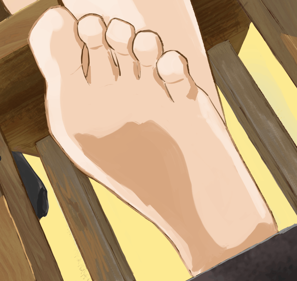
Before
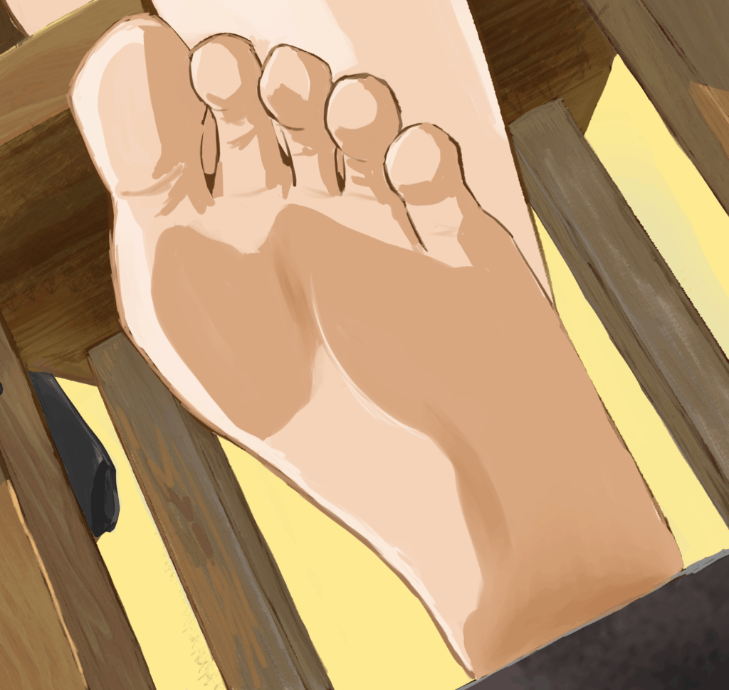
After
Left foot: look closely at the bones and muscles of the foot!
This is feedback on the left foot, the one that’s crossed underneath. Specifically, it’s about the lower leg.
I’ll try dissecting the leg using a sculpting program.
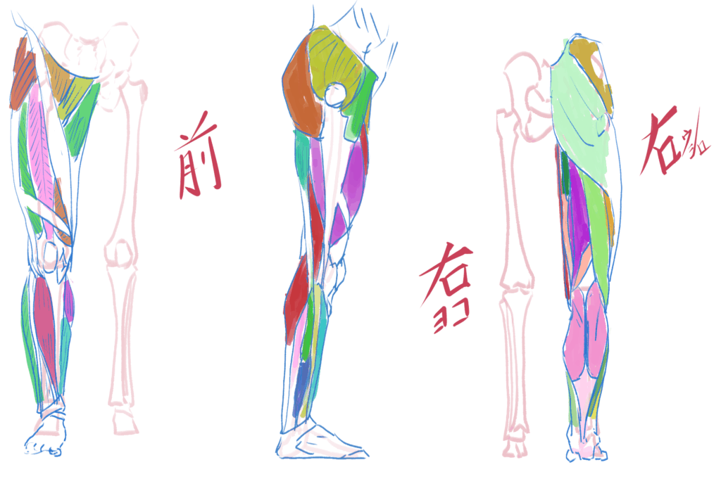
I’ve been looking back at previous feedback, and I often get comments about the bones and muscles.
I used to think it meant that the bone structure was wrong, but it seems like the feedback isn’t about the bone structure being distorted, but rather that the shading is off because the bones that should be visible aren’t. Maybe. Probably…
Basically, there are two bones in the lower leg, the tibia and the fibula, but the tibia, the thicker bone, is the one that affects the silhouette when drawing.
When viewed from almost directly in front, the tibia is located slightly towards the inside of the entire leg and gives the shape of the shin a straight silhouette.
If you cut the upper part of the lower leg, the cross-section looks like this.
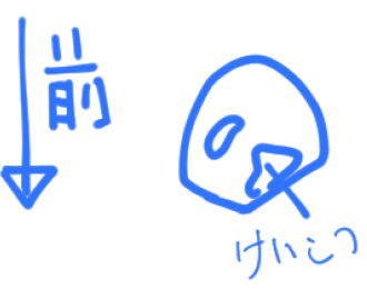
Considering this, when viewing the lower leg from the front, the part that comes closest to the viewer isn’t the center of the lower leg, but slightly to the outside (little toe side).
So, I understood that the feedback was pointing out that in the left foot of Teto that I drew, the light and dark boundary was right around the center, and the part that appears to be closest to the viewer looks like a different part from the tibia.
To elaborate a bit more, I also realized that the inside of the lower leg has less flesh compared to the outside, so it’s less rounded.
This could be interpreted as a rendering issue, but at least I was painting it by just dividing it in half “roughly,” so there’s no doubt I lacked understanding.
I’ll work on adding more volume from below the knee to the ankle, along with the next feedback point.
Left foot: connection is not visible (referring to the leg and foot)
At first, it seemed like it was connected properly, and I couldn’t understand what needed to be fixed, but as I was correcting the previous feedback about the muscles, I started to feel a subtle sense of discomfort.
This is due to the changes in the rendering of the lower leg, and also because the shape of the sole of the foot looked a bit flat, so I slightly reshaped the side towards the little toe.
The first image is before correcting the shading of the sole of the foot, and the second image shows the corrections to the lower leg and the sole of the foot.

I feel like it could use a bit more calf definition, but the leg looks better now, so I’ll postpone further improvements to the next time. (My honest feeling is that I want to finish this soon.)
Right foot: try to capture the shape more
The feedback was that the resolution of the right foot was low. I’ll find reference images of feet and redraw it.
I slightly changed the angle of the right lower leg and redrew the shape. I also touched up the shading a bit.
It was quite difficult for me, especially the little toe of the right foot.
When drawing, I tend to observe my own body, but the shape of my little toe is strange, making it difficult to use as reference, which added to the difficulty.
Overall review section
The human body doesn’t have an overall worm’s-eye view
The length and size ratios are generally inconsistent
This. I think the worm’s-eye view has improved. As for the length and size ratios, I think they’ve improved somewhat due to the slight angle I added to the upper body (or at least, that’s what I intended).
Because the illustration uses an overall perspective, it’s true that I tend to lose sight of the overall balance, but I tried to balance the sizes intentionally.
I tried to create a sense of depth by making the left foot, which is closest to the viewer, the largest, followed by the right foot, right hand, left hand, and face, and as a result of redrawing based on the feedback, I think it looks pretty good.
However, I can’t deny the possibility that someone who is skilled at drawing might see it differently, which is frustrating.
Summary
This time, it was my first time getting feedback in a while, and also because I had some thoughts, I spent a considerable amount of time making careful corrections.
As a result, I can really feel how much the impression has changed.
But what’s still frustrating is that I couldn’t pick up on any of these points myself.
I’ll put up a slider to compare the before and after illustrations. On mobile, swipe to see the before/after.


Looking at it this way, the impression really changes a lot. I think it’s become cuter.
I originally wanted to finish the corrections in a day or two, but it took an insane amount of time because I was writing the blog article while making the corrections.
However, I think the article became easier to understand in terms of where and how things were corrected.
It was a good experience for me because I had never done such a detailed before-and-after comparison and correction before.
I wonder if anyone else goes to this extent to analyze and rewrite their own finished artwork.
Even though it’s called analysis, I did have guidance in the form of feedback, and since I corrected it without being able to check the answers, there’s definitely a possibility that my understanding of the feedback was wrong. But as long as the finished Teto looks cute, I’m going with a “well, it’s good enough” attitude.

Comment