One of the downsides of my sudden start of blogging is that, as mentioned in the previous article, I am lacking in various parts.
Normally, I would gather up copyright-free materials to give them shape, but since I am studying illustration, I decided to create some standard images for eye catchers, and as a result, I decided to create some panels and a few little characters.
Try to draw a little character
Search for reference videos
First, I decided to draw a chibi character to put on the eye-catching panel.
I had never drawn a chibi character before, so I started by looking for YouTube videos that would teach me how to draw them.
I found a few videos that were helpful, but the one that really clicked with me was the one below.
It was a great reference for me, and as a result, I was able to draw chibi characters without much confusion, as I was very comfortable with them.
This is Suzuka Yomogi’s channel, where he draws mainly deformed characters.
He seems to be a chemomaniac. Overall, there are many cute illustrations.
Canvas size and composition
As for the size of the eye-catching image, we are thinking of 1280×720, and the chibi-character image will be created separately and framed into the panel later, and will be 1000×1000, which is a bit smaller.

Suzuka’s video helped me tremendously at the point of drawing from the element first.
The explanation of A+V is excellent.
Pose them in the right mood.
Impressions at each stage of the process
Rough it up from there.
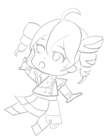
At this point, I feel that it looks like Tet and gives off a cute atmosphere.
I had a feeling that I wanted to draw the chibi character’s lines in a certain width without thicker lines, so I used a millipen to draw a line drawing from here with an outer frame of 8p and an inner frame of 5p.
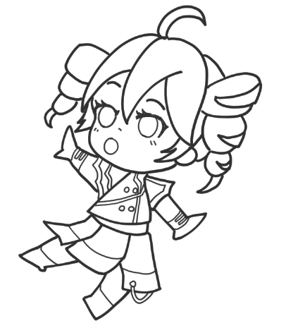
The rest was painted with a large color distribution with a small number of colors and a clear color separation in mind, until completion.

I was satisfied that I was able to depict Korre as attractive enough for my first chibi character.
Of course, there are many things I can reflect on.
For example, I had trouble painting the eyes.
I myself like eyes that are more realistic, but when it comes to chibi-like deformed illustrations, they are completely unmatched.
I was quite worried about it, but I simplified it and fixed it.
The other thing I want to keep in mind is how to draw the tips of the hands and feet.
I would like to add more expression to the fingers on the hands, and I think tapering the feet would be cute.
I would like to define my own format by doing a lot of drawings in this area.
I tried to make it short.
This is the first time I’ve recorded and output a time-lapse video, and I was wondering what it would look like.
It gives off a certain atmosphere, doesn’t it?
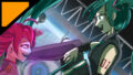
Merge as eye-catching image
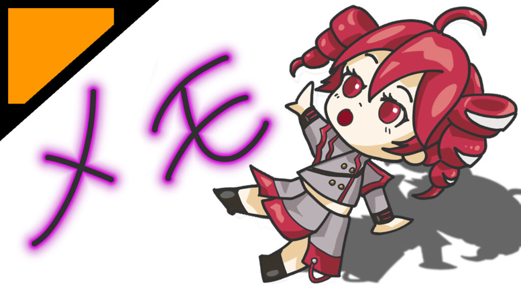
Finally, I combined it with the panels I had prepared and placed the Teto at a slight angle.
I also dropped the shadow somehow and registered it as an eye-catching template.
When I was writing this article, I noticed that I forgot to write some of Teto’s ribbons. …… I want to fix it. ……
I would like to make an eye-catching image for at least one category, so I would like to make an effort to create a few more little characters.

Comment