Reflection on past corrections and the depth of the article.
As I wrote in article #8, this is a recap of the first round of corrections, which I was kindly asked to correct by an artist I happened to know.
In fact, it was roughly a year ago, around April 2024.
In other words, the illustration I am about to drop is also an illustration from a year ago, so I feel that this is an article that requires a lot of courage, but I guess it’s too late for that.

- Subject of correction
- Points raised in the correction
- Responses and actions to the points raised
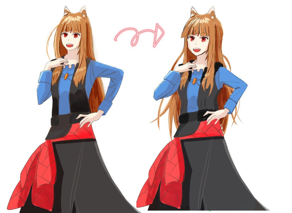
- Maybe the head is too tall! I think just making the face bigger would change the impression!
- Head should be round!
- Since she is a girl, making her neck thinner will give her more feminine power!
- You might want to shorten the torso! (It’s so long!)
- Upper arm and forearm length!(Forearms are too long)
- A girl’s contour tends to look prettier when she shows a little cheek.
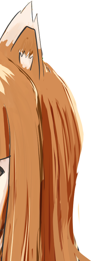
- In the beginning, it is best to draw the flow of hair according to the shape of the head for a beautiful look!
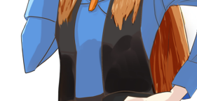
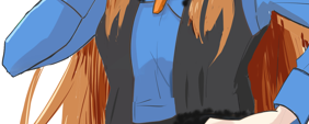
- It looks like it when you draw the structure of the clothes!
- Draw him the fluffy hair that is characteristic of the Holo!
- Summary
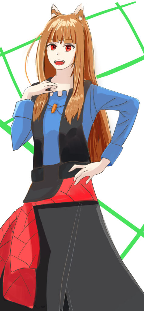
Subject of correction
From Wolves and Spices, Holo.
I watched Wolf and Spice when the anime was reissued, but I have fond memories of the original novel version, which I followed in real time.
The old animated holo was cute, but in the new one, the impression age of the holo is a little more mature and I liked it better.
I remember I was so nervous to send my first correction, I had no idea how it would go.
Points raised in the correction
The figures in parentheses are my personal opinion. Maybe because it’s the first time, I have a gentle impression when I look at it now.
- Maybe the head is too tall! I think just making the face bigger would change the impression!
- Around 6.5 to 7 head tall. If the head is too small, it will be easier to create a cute picture!
- Head should be round!
- Since she is a girl, making her neck thinner will give her more feminine power!
- You might want to shorten the torso! (It’s so long!)
- Upper arm and forearm length!(Forearms are too long)
- A girl’s contour tends to look prettier when she shows a little cheek.
- In the beginning, it is best to draw the flow of hair according to the shape of the head for a beautiful look!
- It looks like it when you draw the structure of the clothes!
- Draw him the fluffy hair that is characteristic of the Holo!
Responses and actions to the points raised
It was the first time for me to revise an illustration that I had drawn once, and I remember that I had a very hard time even making a small correction.
Even now, I still have a hard time making corrections.
Let’s look back at the process step by step.
Maybe the head is too tall! I think just making the face bigger would change the impression!
The corrections were made directly on the submitted illustrations with red pens, and this point was pointed out by adding a rough silhouette of the whole body based on the length of the head and arms, and the tiny face.
I have also received comments that if you are going to do fan fiction, you should look at more of the original work, which is 6.5 to 7 heads tall.
This illustration itself is a shot of an animated scene, but I haven’t observed the original picture at all.
This still gets pointed out to me, but I am coming up short in my observation skills.
Head should be round!
This is a point of view after receiving a glaring red ink on the face area.
Certainly if you look at the back of the head or the top of the head, it looks head distorted from the placement of the face.
Especially the back of the head feels distended.
I draw in the style of a shaved head with hair as a beginner, but I am still very conscious of the fact that when I put hair on it, it tends to expand. (I can’t say it’s done.)
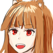
It was an easy to understand but difficult fix. Looking at it now, the back of my head is still huge: ……
Since she is a girl, making her neck thinner will give her more feminine power!
You’re right, the neck is thick.
It will be with the size of the face, but I managed to make it a little thinner.

I’m not very conscious of my neck, and even now it tends to be long, but I like the lines from the neck down, so I want to be able to draw it well.
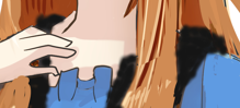
You might want to shorten the torso! (It’s so long!)
This is typical of the lack of attention paid to overall balance.
I remember being concerned with putting together clothes that looked like that.
Do I have a memory? Maybe it just feels that way now that I think about it.
Upper arm and forearm length!(Forearms are too long)
Are the forearms too long or the upper arms too short?
Looking at it now, the balance is obviously wrong, but at first I drew good elbows! I thought. As I recall.
Correct arm circumference in conjunction with the aforementioned torso length.
This was the most difficult part of the correction to point out. I remember this one very well.
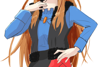
I had an angled wrist on both my right and left hand, and no matter how many times I tried to fix it, I couldn’t because it was either broken somewhere or the balance would collapse.
Cut, paste, stretch, overwrite, rotate.
I don’t remember the details of how I finally fixed it, but it looked somewhat natural.
I still think the forearm on the left hand (right side towards you) is a little long.
A girl’s contour tends to look prettier when she shows a little cheek.
Talk about contouring. The skeleton is not visible.


I believe that the face can change the impression of a person’s face with just a little bit of effort, but I have trouble with that little bit, and it is the part I have trouble with every time I draw an illustration.
Even now, I want to draw a pretty face, but it often doesn’t turn out pretty, and it’s going to follow me for the foreseeable future.
In the beginning, it is best to draw the flow of hair according to the shape of the head for a beautiful look!
I am not good at drawing hair as well, to the extent that when I write articles like this, I feel that I am only bad at it. Although I am not good at it, hair is one of the top three areas I would like to be able to draw well.

I have the feeling that I didn’t fix it well, but did I manage to make an effort?
I have an image of the hair I want to draw, but I can’t express it even a millimeter, and it’s sad that every time I draw it, it ends up looking like a paste.
After all, if the hair can be drawn fancy, the entire illustration becomes fancy, so I want to do my best.
It looks like it when you draw the structure of the clothes!
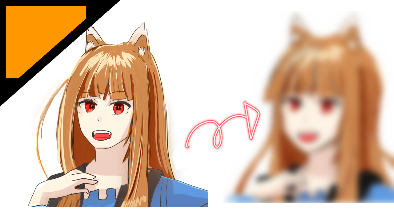
This is the animated version of the Holo with the arrow in the fluffy area around the neck.
I couldn’t figure out how to draw the fluff in black at all, so I had to make it look like that.
I still don’t understand how to make it fluffy.
Draw him the fluffy hair that is characteristic of the Holo!
I want to draw it! But it’s not fluffy!
However, I have increased the hair somewhat.
The gap between the image in my brain and the illustration output from my right hand is the hardest part.
I would like to fill this gap somehow.
Summary
So it was a process of correction from the initial correction remarks.
I think it took me quite a long time to make the corrections themselves.
I don’t know how to fix many things.
When I put them together like this, I am proud of how much they have improved, but as I noted in the article, there are still some oddities in the revised illustrations when I look at them now.
Does this mean that my eye for observation has also grown somewhat?

Comment